CHEERS
A WEBSITE YOU CAN EXPLORE.
Scroll inside the device, explore the cocktails and choose a drink for your mood.
See how the lettering and watercolor set the tone.
Switch between light and strong drinks.
The bartender’s recommendation changes with your choice.
The screen scrolls independently. A tap or swipe pauses auto-scroll.
THE IDEA.
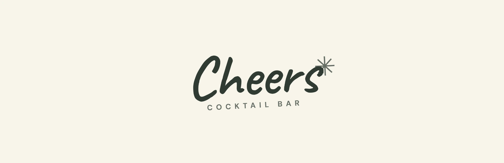
Cheers began with a simple scene: friends lingering over one more drink. I carried that feeling into the handwritten logo, the website and a cocktail menu made to browse slowly.
THE IDENTITY.
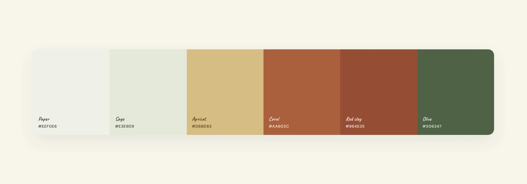
I drew the wordmark by hand and added a small spark. Sage and cream keep things soft; olive and clay bring in contrast. The identity guide records the logo versions, clear space, minimum sizes and type choices.


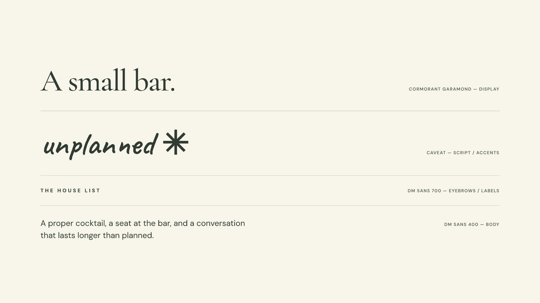
Cormorant Garamond for editorial headlines. Caveat for the wordmark and accents. DM Sans for information and navigation.
Open identity guide PDF →THE WEBSITE.
This is a working prototype. Scroll through the bar’s story, filter the cocktails, then choose a mood and see what the bartender suggests. You can switch between the phone and desktop views above.
ONE EVENING.
The logo sits on the menu, the watercolor moves onto the site, and the cocktails stay recognisable in both. Open the live preview above if you want to see how it feels in use.
LET’S TALK.
Have a place or a product you want to bring to life? Tell me about it in the brief.