NIVAL
A LAMP YOU CAN SWITCH ON.
Scroll inside the device and switch the light. The same site runs live in a new tab.
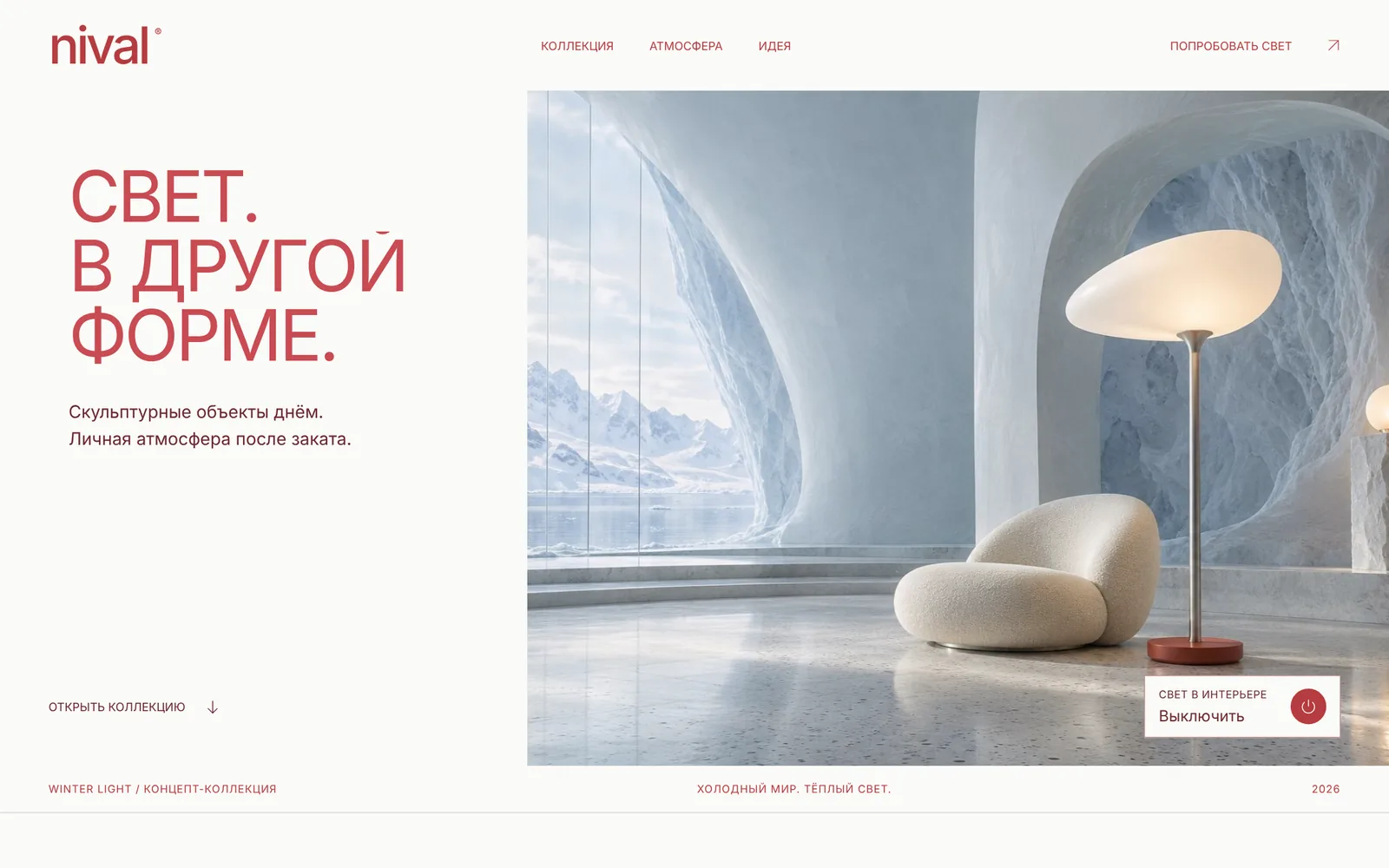
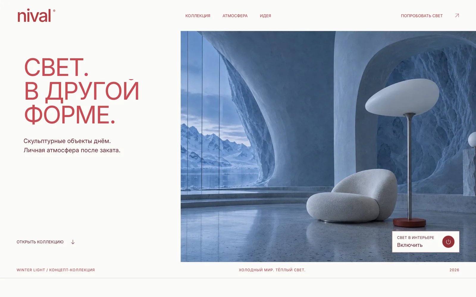
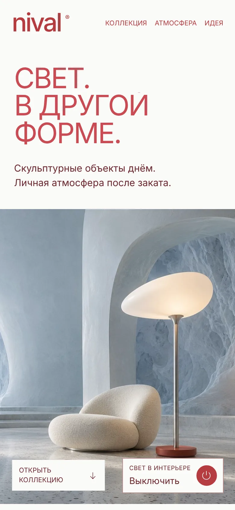
01 / Press the power button on the first screen: the lamp goes dark and the whole room follows.
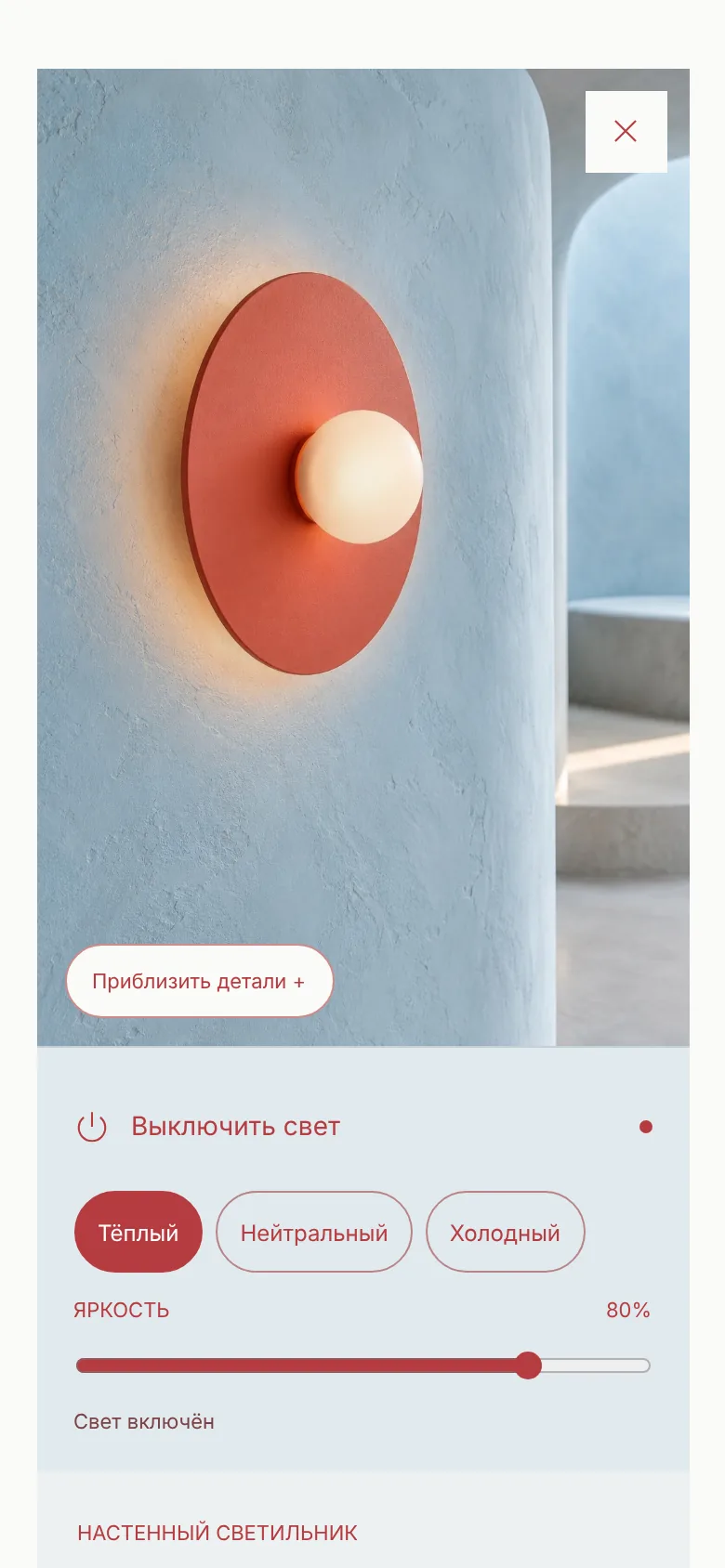
02 / Open any of the eight objects, change its brightness and colour temperature, flip through the collection.
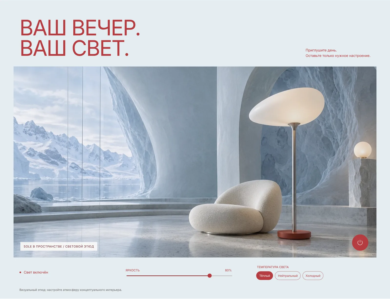
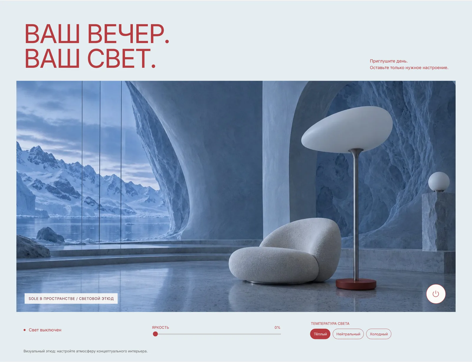
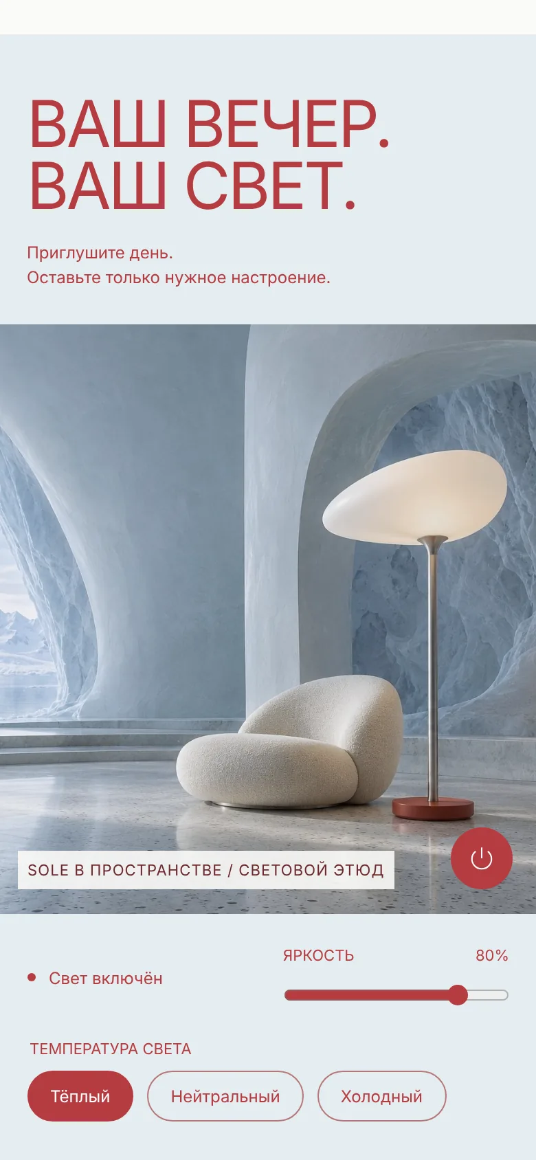
03 / In “Your evening” tune the mood of the whole room with a slider.
The screen scrolls on its own. Enlarge opens the preview full width.
NIVAL is a self-initiated concept, not a client project. The brand and lamps are fictional, the interior images were created with AI, and the light you switch is a visual simulation. The concept site itself is in Russian.
THE IDEA.
NIVAL is an imagined collection of eight sculptural lamps for an icy interior. By day they are objects; after sunset they become a personal atmosphere. I built the concept around one gesture — switching the light — and let the whole page answer it: the room, the objects and the evening.
THREE DECISIONS.
- One switch instead of a menu.
The first screen has a single control, the power button of the lamp, and the whole room answers it.
- Light as a material.
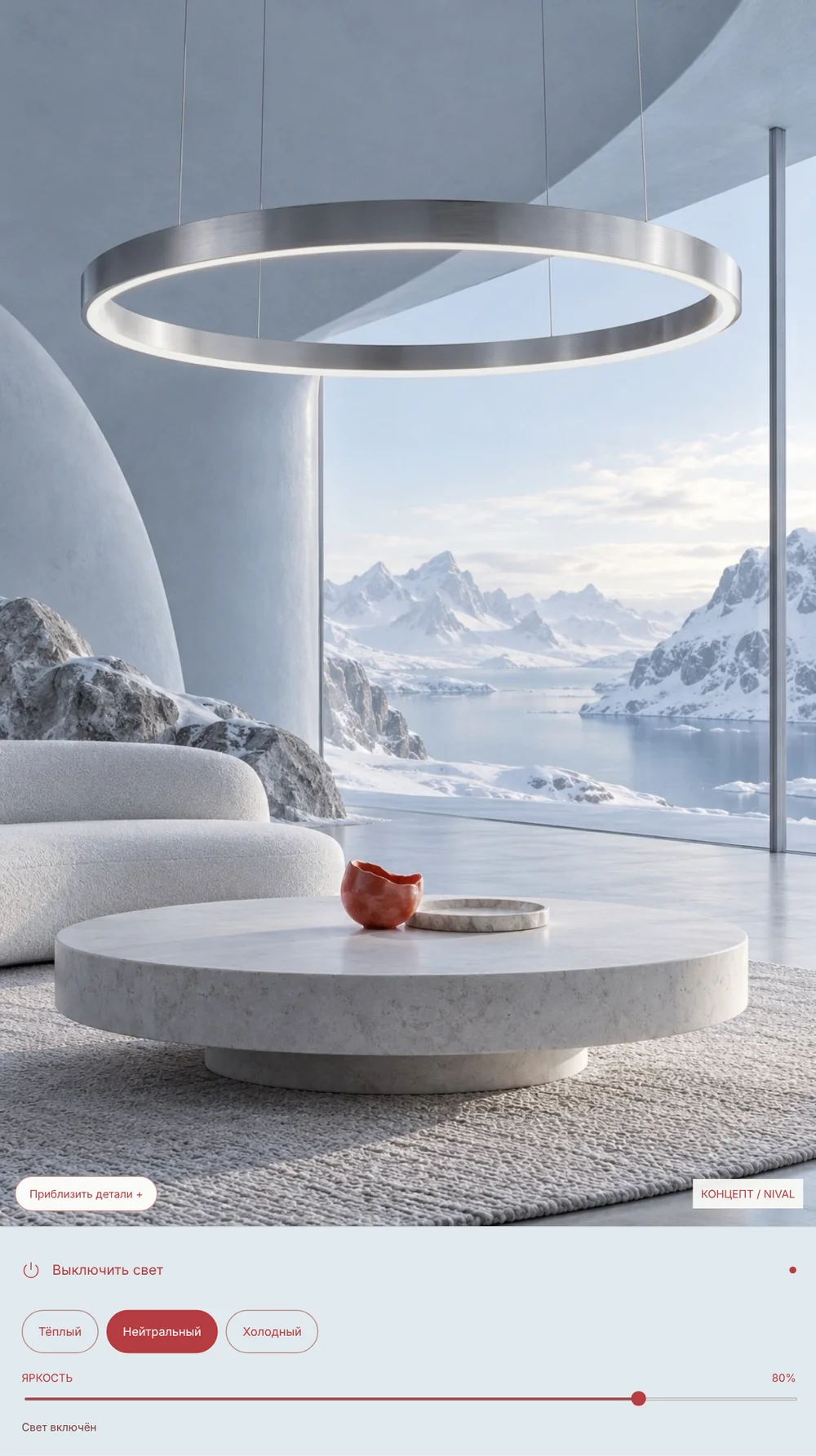
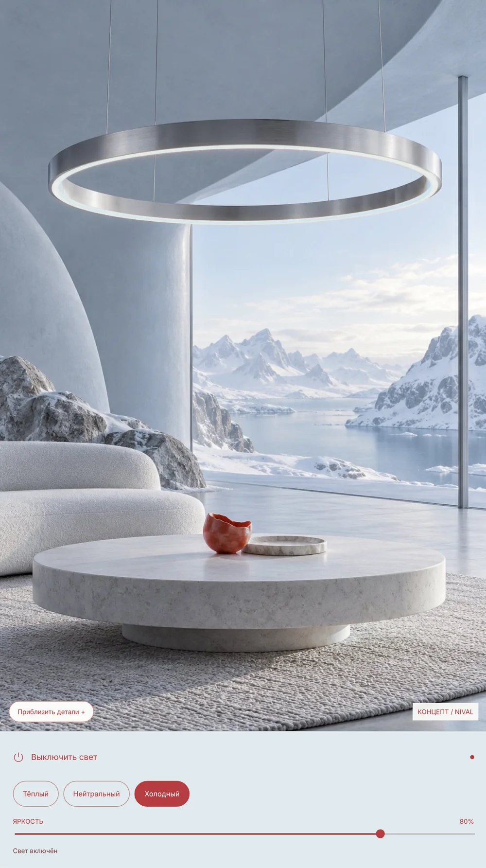
Every interior exists in a lit and an unlit version. Warm, neutral and cool light recolour only the glowing parts of the picture, so the ice stays the same.
- A quiet interface.
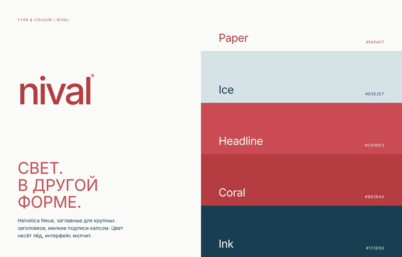
One grotesque, one accent colour and no decoration. The colour comes from the photographs and the lamps.
LIGHT IS THE INTERFACE.
The first screen is a single switch. With the lamp off the room goes cold and quiet; with it on, the warm glow returns to the stone and the glass. Nothing else on the page needs explaining.
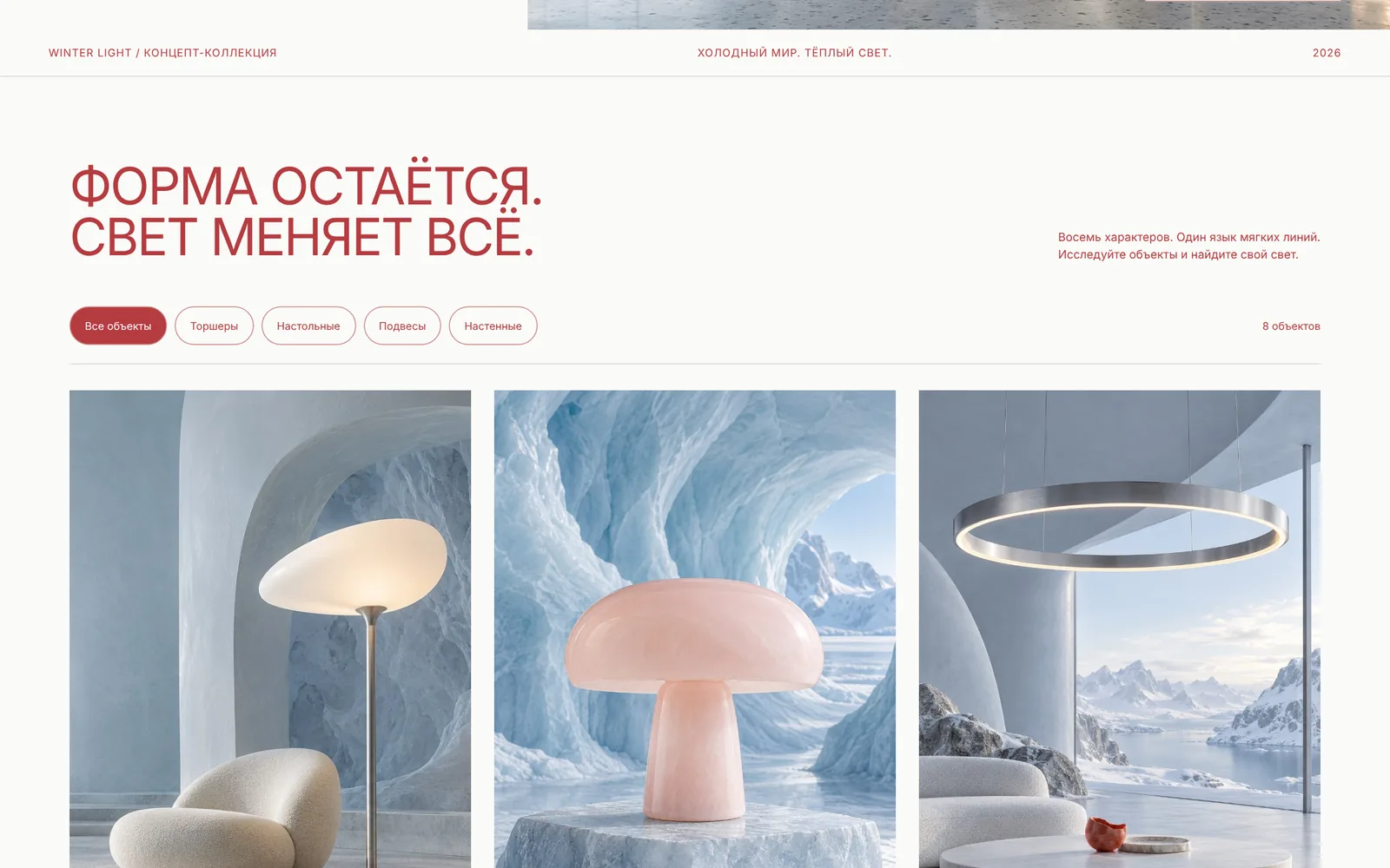
THE FORM STAYS. LIGHT CHANGES EVERYTHING.
Eight objects, four families — floor, table, pendant and wall — each in its own piece of the same ice-blue interior. Open one and it gets a card with its character and its own light: brightness, and a choice between warm, neutral and cool.
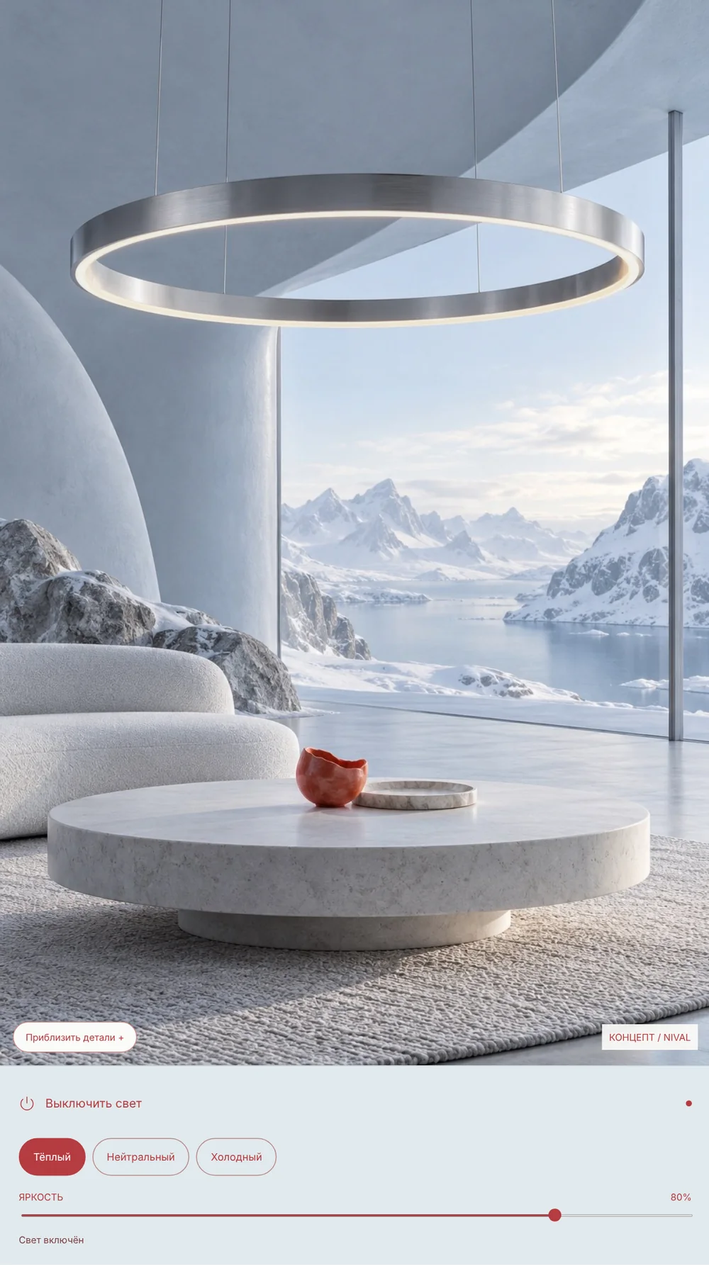
YOUR EVENING. YOUR LIGHT.
The last interaction hands the room over to the visitor: dim the day, pick a temperature and keep only the mood you need. It is a visual study, honest about being one, and it closes the page on the idea behind the name — between the object and the feeling.
THE LOOK.
A quiet grotesque in capitals for headlines, small spaced capitals for labels. Five colours: paper, ice, a lighter coral for headlines, a deeper coral for details and controls, and ink. The photographs carry the colour of the ice, and the interface stays out of the way. The page works the same way on a phone.
LET’S TALK.
Have a product you want to give its own light and its own story? Tell me about it in the brief.