
010203040506HomeAbout meMy workServicesExtrasContact
/
← All projectsNaming · Logo · Colours
03 / PHOSSWIMWEAR & BEACHWEAR · CYPRUS
NAMING & BRAND IDENTITY

PHOS

Naming and identity for a Cyprus swimwear and beachwear brand.

NAMING · LOGO · COLOURSSCROLL TO EXPLORE ↓
A woman floating in deep blue water, the visual mood of PHOS
PHOS / ISLAND VIBETHE BRAND’S VISUAL MOOD
01 / PHOS

PHOS MEANS
LIGHT.

The PHOS project began with its name and logo. Cyprus itself was the starting point: its sunlight, the sea and life on the island.

PHOS takes its name from the Greek word φως, meaning “light”. The idea was to make that connection to Cyprus felt in the name itself.

MY WORK: NAMING, LOGO AND COLOUR PALETTE

02 / PHOS

THE SHAPE
OF PHOS.

I drew the lettering for the brand. Straight strokes sit alongside open curves; the finer ISLAND VIBE line completes the logo. Those same curves became the pattern.

PHOS ISLAND VIBE

Two versions of the logo: blue on white, or white on blue.

03 / PHOS

BLUE
& WHITE.

Just two colours: deep blue and white. They recall the sea and bright island light, while the contrast keeps the fine lines of the logo clear.

DEEP BLUE#0A3B7E
WHITE#FFFFFF
PHOS / PATTERN

THE PATTERN.

The logo's curves become a repeat of their own, shown here simply in the original blue and white.

04 / PHOS

THE SMALLER DETAILS.
DETAILS.

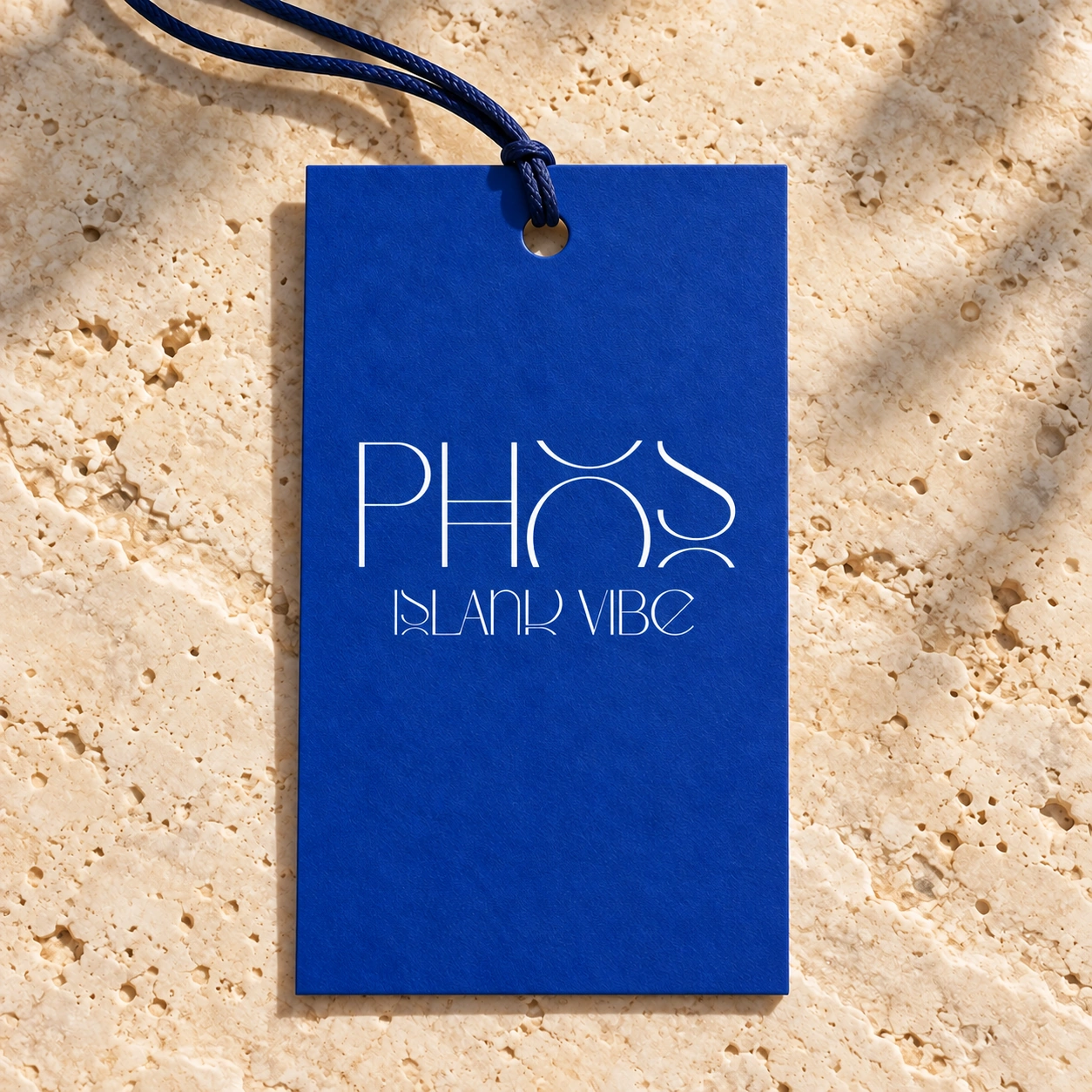
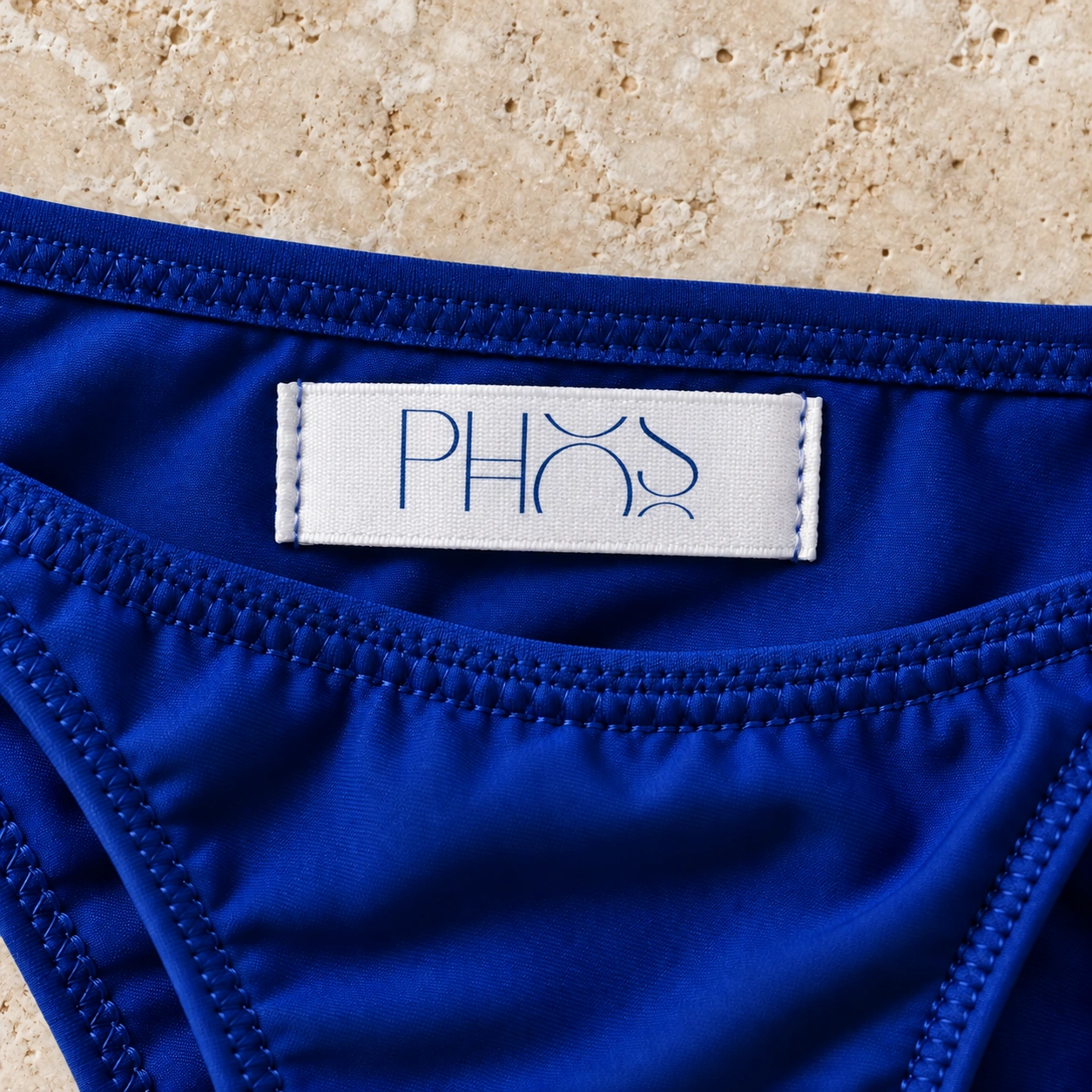
Two colour versions of the hang tag and a woven label. These small mockups show how the mark lives beyond the screen.

PHOS ISLAND VIBE on a deep blue hang tag
01 / Blue hang tag
White PHOS hang tag with the original dark blue logo
02 / White hang tag
PHOS mark on a woven garment label
03 / Woven label
YOUR PROJECT

LET’S TALK.

Tell me about your brand and what it needs. We can begin with a name and logo or build a complete visual identity.

FILL OUT THE BRIEF →ALL PROJECTS →